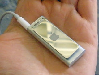
The One Button Lie
 As a gesture of kindness, apparently I've been very nice lately, my boyfriend gave me a new iPod shuffle last week. I was so excited! Being one to actively buck trends, when MP3s originally gained popularity, I turned away from Apple and towards the Creative Zen. It was reasonably priced and I couldn't imagine what could make such a large difference on essentially the same device.
 Yes, Grasshopper, I learned my lesson. From day one, it was difficult to upload songs and the Yahoo! interface it required was really lousy. I'm no great audiophile, I have maybe 40-50 CD's among which (much to my boyfriend's dismay) are showtunes and Billy Joel. As I said, no great audiophile. But like anyone, I enjoy having my music with me.
Since acquiring that MP3, I have begun to work out at the gym more and I also bought a computer with Windows Vista last summer. It is now April. I've been trying for months to figure out how to get more music onto my MP3 with Vista and through many a google search have found that it's not an easy task. I've also become a big fan of Podcasts. The NPR science shows, This American Life and others that I assumed would make commuting and working out much more pleasurable. But the Creative Zen doesn't play well with the normal podcast files and I never did figure out how to get them on my player.
Enter the Shuffle. It's sweet. Tiny. My first fear is "oh my gosh, I'm going to lose this." I haven't yet. Without much difficulty, I sign up to receive many wonderful Podcasts and start loading Billy Joel and the soundtrack from Chess onto my Shuffle.
The trouble arises at playback. The instruction book that comes with the Shuffle is incredibly limited and I admit I'd rather talk to a human than read a manual. I fussed around with it a bit then hit the Apple store this weekend. I explained my desire to create playlists, as it promised, and was trying with all my might to understand the mental model behind the organization. The problem with one button/no interface devices, I find, is that the entire workings of the device need to be in a map in your head - or you need to print something out on paper. The paper option is annoying and the map in my head is not always reliable.
After talking to two equally surly 20 somethings I did get confirmation that yes, you can indeed create playlists, like file folders and group your music accordingly (workout, meditation, etc.). Wonderful! That's what I hoped for and I went away happy, not exchanging it for a Nano with an actual screen. I found I've become quite attached to it, even in my frustration. It is both a lovely gesture of kindness as well as something so compact and portable that I take it with me everywhere. The emotion evoked by the design is not lost on this designer.
And yet, the usability issues prevailed. I tried to switch between playlists with little success. Click, hold, release, click. One click forward, two clicks pause, three clicks does something, too, but I can't remember that much. I searched for a printed list, I watched the video and "followed along at home" as the nice young lady took me through the clicking process. Once or twice I was able to switch lists, but never reliably.
Today, success, me thinks. A very nice young man at the downtown Portland Apple store was patient and worked with me. He got it to work, handed it to me and, again, I failed. He watched, we talked, "what is your hand position?" "click here, not there" (millimeters apart). Finally, 15 minutes later, we discovered that I was so frustrated, I was actually just clicking too hard. The one button is actually 3 buttons, apparently all in a line. If you click too hard, you confuse it. It thinks you are pressing +/- and playback and it just goes back to playing music.
So, is the Shuffle successful with it's "one button"? It's a great idea in theory, there is a trade-off to having this wonderful, lightweight device full of music and no big buttons to push. The trade-off for me was two trips to the store to understand how to really use the device. The computer interface is leaps and bounds above Yahoo!, but I'm still not sold on the mono-button. Don't throw away those scroll wheels. They may come in handy when dementia sets in - which feels like it could be any day now.


Comments